|
|
|
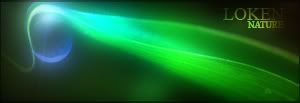
Two things.  If you're asking for critiques on this, it'd go in "Personal Showcase" (which actually isn't under graphics.) Also, if the image stretches the page, please post a link to it instead. Nice wallpaper though.
|

|
|
|
|
|
|
I like the middle part, but the other parts are too empty, too much white space.
|
|
|
|
|
|
Oh dear. I hope you're all not these kinds of folk that just lke to fill your pictures up with gubbins, throwing all elements of design out of the window? XD
|

|
|
|
|
|
No not really, just seemed a little empty, though. But I still like it. 
|
|
|
|
|
I actually like the blank spots... makes seeing all your icons much easier if you line them all up in just the blank areas 
|
|
|
|