|
|
Well that's great news (hopefully, lol) Congratulations Jesse 
|
|
|
|
|
|
You need to use more images man. Look at the Studio Cero header. It's not just plain text, there are graphics all over the place. Make use of logos and fun shapes, we are on our way into Web 3.0 now and you are still stuck in about 1.6. Use more colors for the text as well and maybe have a more fancy text for the logo. And most important of it all, make use of your space (although remember not to make it too crowded) Keep practicing man
Last Edit: Jun 27, 2010 23:24:01 GMT by NinthJake
|
|
|
|
|
First up, its way to wide. It doesnt fit on the screen im currently using. The whole thing seems a bit flat : -/ Like, no textures, no gloss or grunge. Im not sure what this style is xP I see both grunge and gloss. Clearly a Web 2.0 site. Main problem with it is, as tov said (he is a good critiquer) its too wide. Also why is it a square the ends abruptly then goes to a light colour?Another thing is say is put some slight gloss on the nav bar etc. Decent effort tho, maybe dont use kuler next time cause those kulers disgust me.  Ok so you guys want more grunge then? I'll try to fix that and remove some of the gloss problems. The width can be fixed in the coding progress I believe. About bold: Where do you see that? Thank for the critique guys :]
Last Edit: Feb 6, 2010 11:27:53 GMT by NinthJake
|
|
|
|
|
This is my first go at a Wordpress template. It is also my first time letting Adobe Kuler decide the colors for me. I am pretty happy with the end result. C&C please. www.codedpreview.com/folders/g/326d6cb2/
|
|
|
|
|
That's because it's animated. Every half an hour it switches and says "And I'm banging your mom" for about 5 seconds. ...does it really?  NOOOOOoooooo, you tricked me. I was sitting here for 25 minutes waiting for the switch before I saw this  In all seriousness though. If there is still time then I guess that I can try to whip something together.
|
|
|
|
|
Thanks Chris 
|
|
|
|
|
Made this Twitter background a while back. Just noticed that I never posted it here. Tell me what you think please. 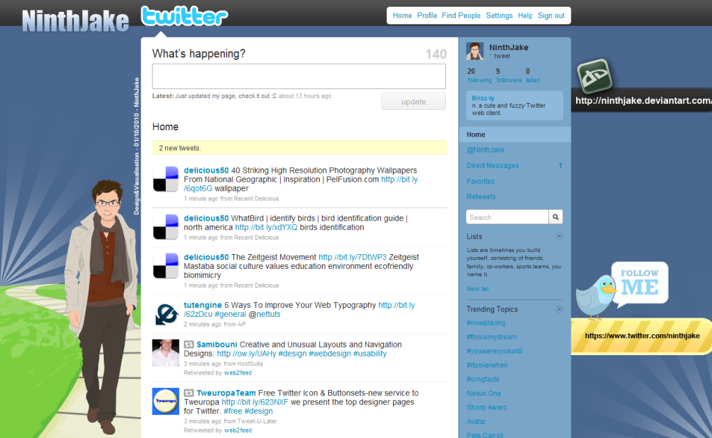 Oh and the background fitting problem has been pointed out many times but seeing as Twitter doesn't have a "Center background" option, I can't really do anything about it 
|
|
|
|
|
As have been said, the bright text in the sidebar hurts the eyes. Darken it a bit. I can't really think of something else. I see you are using partly bolded text a lot. That is something I have to practice. I just love the hover buttons in the navbar. They look really awesome and I will have to try and make that effect myself as well Good job on everything dude.
|
|
|
|
|
Awww. It sucks to be gone for a few weeks and come back just to see that you JUST missed a fun contest
|
|
|
|
|
Well the website is obviously not finished yet but you should work more on getting your images more crisp and use the space more. For some good tutorials on how to design websites, look here. net.tutsplus.com/creativenerds.co.uk/tutorials/70-tutorials-using-photoshop-to-design-a-website/www.webdesigndev.com/About the forum. Never ever use red text on a black background (never use red on black in general) Because color-blind people can't see it then. The rest is pretty good I guess but you should improve the logo so that it is just not only text. Get some graphics in there as well. And preferably use a lighter color for the text so it is easier to see it on the dark background. Good start though mate
|
|
|
|
|
Can you make your own game out of the links you provided at the top? No you still need a game engine to make the game. These are just the models. Great share btw. Thanks man
|
|
|
|
|
Alright Thank you Chris!
|
|
|
|
|
It would probably be a good idea to recreate it in photoshop first but sure. I am interested to see how it looks
|
|
|
|
|
I need some help with displaying some information in Smangii's side tables. I want to have the user's own profile displaying in one of the side tables but I am kinda new to javascript so I need some help with that I want to have the information display in this order. Display Name. Avatar. Rank. *Gap* Posts. Karma. User is Online/Offline. I know the "document.GetElementsByTagName" but I don't really know how to display them  So if anyone could help me with the code then it would be greatly appreciated Thanks.
Last Edit: Dec 17, 2009 10:54:57 GMT by NinthJake
|
|
|