|
|
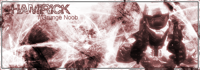
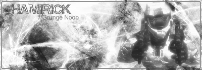
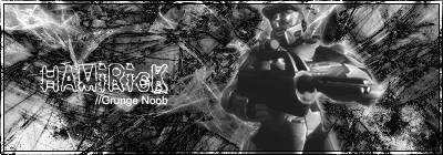
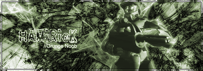
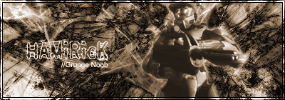
Well here is my 2nd grunge in 3 vesions... still not good, but i think i'm getting better. 1  2 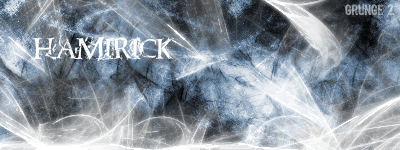 3 
|
P16Studio: 80% Complete

|
|
|
|
|
u r getting better im only gonna rate the first one cause thats the best one first of all ADD A BOARDER,a simple one pxl boarder will do fine, i really like the bg it has the right amount of saturation that it should have,the text is ok but i would try adding a 1 pxl black boarder on that to, also try making it a blue colour overall its not bad you r deffinantly getting better.  Last Edit: Aug 31, 2005 14:33:43 GMT by jc
|
|
|
|
|
|
yeah those r alot better i like the blue one in the second set try multi colouring though if u need a tut ill pm it to u
Last Edit: Aug 31, 2005 15:58:51 GMT by jc
|
|
|
|
|
kk... can do just was making these in B&W and forgot  ... i can multi some f the above(i think )... but ya if you want you can... i need all the help i can get.
|
P16Studio: 80% Complete
|
|
|


 :
: