|
|
|
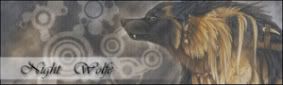
Overall I like the look but I think the banner could be improved upon or or at least made a little bigger... it kinda blends in to the background a bit right now I think. Other than that Great job! 
|
|
|
|
|
|
|
thanks for the suggestion. i might brighten the banner some.
|
|
|
|
|
|
|
I do like these colours you've used, if that brown was used to with anything else I don't think it'd match. The info center you're using appears to be broken somehow, haha. It says one person is online but isn't showing anyone online, it's a good info center, when it works, maybe you could see about getting a custom info center, would make your forum a lot more unique and cool. Myself, i'm a fan of stickfigure movies and sometime make my own (using pivot), so I think it's a really good concept for a forum and it could work if you draw in the right audience, a little advertising and SEO is all you need. I think it's a really neat skin and the colours are cool, all images I can see seem to be complete and working, no problems there. One other thing I notice is the fact that your affiliates table is looking bare, try get some affiliates, maybe with the same forum subject as yours, would bring in some more activity. Overall this is a very cool concept and design, well done and good luck with your forum. 
|

last.fm | Off Topic Forum | Coming Soon: Resist The System
|
|
|