|
|
Yes, I finally got it coded. Big thanks to DregondRahl <3 Oh, and a word of advice - Don't use IE6, we're working on making a separate version for that browser, to basically tell you to upgrade browsers.  varia.proboards.com varia.proboards.comCheck it out and feel free to leave comments or CC.
|
Playing in the dirt
We find the seeds of doubt
Don't water them with your tears
Don't think about all the years
You'd rather be without
|
|
|
|
|
Still as awesome as it was the first time I saw it. Doesn't lose it's appeal.   Last Edit: Feb 23, 2009 16:12:18 GMT by JD
|
|
|
|
|
The whole water idea is just awesome, very creative. Also like how the boards are spaced out, makes it looks neater. Not sure about the on/off buttons though, there are too many of those out there already. Everything else looks good to me, now all you need is some content. 
|
|
|
|
|
|
I love it!!!!!!!
I am thinking about joining , but anyways...I love the ocean design. Now , the content part of it all!
|
|
|
|
|
|
lovely. I would love to see something other than darkness the lower you get. the banner is so wonderfully light and well done, I just hate to have the rest of the background bland and dull.
otherwise, very nice!
|

What, you wanted to check out a shweet tutorial?
|
|
|
|
|
Wow. I didn't think it would ever get coded. Amazing.
|
|
|
newfieldgrafix
Guest
|
|
Firstly, NICE WORK! It's not everyday you see a unique design. The whole transparency adds to the water theme. And the colors match perfectly. The coding looks like it took a lot of time (and I can't code). Please however, don't clutter it up (I know that's a stupid thing to say), the minimalist look works with the water. Thanks for sharing your tallent!
|
|
|
|
|
|
lovely. I would love to see something other than darkness the lower you get. the banner is so wonderfully light and well done, I just hate to have the rest of the background bland and dull. otherwise, very nice! It gets darker simply because that's what happens in the real sea/ocean...
|
|
|
rickace
Guest
|
 Issues: Board Names, and Board Descriptions. Skin highlight colors don't mean much in the colors you used. And you aren't giving a unique feel, for us to join. But other than that. It's perfect 
|
|
|
|
|
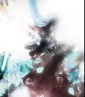
Banner is a brushed over stock with a few filters, and the rest of the graphics are bland and cliche. Doesn't help that the concept is vastly unoriginal outside of ProBoards and that the forum is missing key components like a logo. Superb coding, just as everything Dreg codes. Emoticons are basically just animation copies of the typical stuff you see around dA, nothing unique.  2/5. 1 point for superb coding, 1 point for the effort and because I feel bad handing out a 1/5. On a whole it's looking very incomplete on the design side. Very bland and boring.
Last Edit: Mar 11, 2009 1:17:16 GMT by Spektral
|
|
|
|
|
Holy moly, is that a Proboard? My god, it is. I love how you made it, but I slightly agree with Alex. It is a little to plain. Why not add a little towards the bottom? But I have to admit. AMAZING! If there was a 4.5/5, I'd give you it, but there isn't so I'll give you this: 
|
|
|
|
|
|
|
"The secret to creativity is knowing how to hide your sources" Hilarious. I'll lower my rating now that I know that a lot of the creativeness on there isn't your work. 
|
|
|
|
|
In light of the new evidence, I too, will have to lower my evaluation. Despite the fact you actually told people that the water wasn't a stock, and the site was made from scratch, it would have been amazing had it been true. It was too good to be true. And, hide your sources better.
|
|
|
|
|
I never said it was made from scratch LOL. In fact I said it was NOT made from scratch, as a reply to superiorgamer. It was a single color brush.. and I laugh at you fredy, or spektral, or whoever you are.. if it's so easy let's see you do it.
|
Playing in the dirt
We find the seeds of doubt
Don't water them with your tears
Don't think about all the years
You'd rather be without
|
|
|


![Nathan[Gone] Avatar](http://sz-ex.com/_v2/avatar/v2_orange.png)