|
|
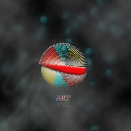
Was playing around with certain features on PS for about an hour, and got this:  C&C welcomed 
|
|
|
|
|
|
Aside from the over stroking of the text and the large red piece on top of the shell (the thing that looks beveled), I think its pretty good. 
|
Latest artwork: Artist's Crescendo
My Devart
|
|
|
|
|
|
Hmm, thanks. I'll rework on it soon.
|
|
|
|
|
|
|
I assume you have a reflective floor because the text reflects.
But then how does the text reflect and the abstract object does not?
Also, the reflection for the background/sky isn't reflected properly because, well, it's not an "exact" mirror on the floor. Or doesn't appear to be to me anyway.
|
|
|
|
|
 Reason: Hello! I like the idea of the circle, besides the giant splotch of red!!! without that it would look great!! I also believe that a plain background would look better, the one you have now is blurry and, no offence, crappy looking, takes the focus off the image itself, maybe go with a wall to floor look in the background! The text wouldn't be to bad but the outer glow, or stroke is to much and the colors are overbearing for a text, i believe a text should be simple but fun at the same time, generally one color ( with a overlay gradient on it ) and a simple stroke and a drop shadow does the trick!!
|
|
|