|
|
Here's the results as judged by Josh. Next SotM will be up once Josh returns from his hiatus.
Signature of the Month: July '07The first SoTM sees its ending. With the introduction of SoTM we also introduced something that I don't recall ever seeing before: The ability to enter multiply entries. I believe the extended period of time and the increase in number of allowed entries allowed entrants to go outside the lines a bit and make something different than their normal entry. I won't be reviewing every image, only handful. Some people may have all of their images judged, some may have none of theirs judged. Images are in no order whatsoever, only the final image which is the winner Judging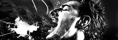 by Mukei This image really stood out to me. It felt rebellious. Outspoken. The high contrast and lack of color really plays well with each other, which is an oddity. The blending job done on this image is spectacular, especially on the back of the head. I also agree with your choice of no text, good job. There are two things I would suggest, though. A cinema border would really add to the piece (Imagine watching a widescreen movie on a full screen TV) and it would make the image "pop" more. Also, maybe some areas of color. Not much, just something to draw your attention.
 by Gray292 I liked this image because of the abstract vector work done in it. You don't see stuff like this very often in signatures and it was done quite well. It could use a bit more contrast but the colors are, otherwise, quite good. The "Gray292" text in the corner should be dropped though and make the "Time" text a little lower to take up that space and be more readable.
 by LPF This image really captured new age abstract very well. Great color mixing with a lot of darkness and subtle abstract effects. You pulled it off very well, Adam. I especially like the border on the bottom. Makes it stand out. Only thing I can suggest is to put some small, white text dead-center in the dark area at the right.
 by rebornps I really liked this image. The almost-gray-scale effect went very well. The abstract style chosen works well with the stock image, though you should have cleared her body of the abstract work- especially over the skin of her neck and breasts. Another thing is the hand. You should have brushed that out of there or clone-stamped it out of there. IT just doesn't fit. Some text would have been nice too, maybe saying who the girl is (Elisha Cuthbert?)
 by RKO I included this image because of the improvement he's shown with it. You've managed to give your signature a focal point, something you've struggled with. Even the text is a major improvement (Though, STOP WITH THE NAME!! Make it something relevant to the image). The one thing I think this image could have used improvement on is the background. It's too bland. Try adding some white brushing to it and then messing with blending effects.
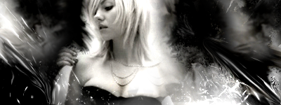
And for the winner...  by LPF This image really pulled everything together. Great stocks, great brushing, great font choice, great border, great everything. I love the blurred background that almost looks like frosted glass and the overall color tone to it all. Good job with the text, though it could have been easier to read. Yet another image with subtle abstract work but it was done very well. Congratulations!  Last Edit: Aug 21, 2007 18:37:40 GMT by Chris
|

|
|
|
|
|
|
Congrats Adam. I'll put up the next one soon. Today or tomorrow.
|
|
This is my old account. This is my new account
|
|
|
|
|
Congrats 
|
|
|
|
|
|
Congrats 
|
|
|


 ∞
∞


