|
|
|
|
I like it. A few things remind me alot of ED.
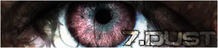
anyways, Loving the banner. Good dhoice of colors. Good design. Good concept.
Menu is also good but the buttons are fuzzy in places.
Like the head/base AND the gradients. Love em actually.
Background... I'd change it to a color color. Beause I'm looking on a big screen and I can clearly see where the background ends.
Sorry for the crappy rate. Maybe I'll do a better one later when I get home.
|
|
k
|
|
|
|
|
|
The shadows on your head, base, side and menu stick out far far too much, because of their opacity, I'd decrease the overall opacity to half at least, and possibly even set the blur to be a bit stronger.
|
|
|
|
|
I'd change it to a color color. Fail?
I like it. However, when I first saw the background, I thought there was a blotchy spot on my new monitor and I was going to have to kill somebody. Haha I agree with Stinky regarding the opacity of the shadows. Reduce the opacity by 10-15% maybe. Other than that, I don't really have anything to say. It's a great skin!
|
I'm gonna start dishing out internet beatings if people keep it up with this 4chan shit, I swear.


|
|
|
|
|
Yes, the inspiration did come from ED and SI v3. Thanks for the critique and advice! 
|
|
|
|
|
|
|
Not much to say that hasn't been said...except I noticed the "Visual Arts" part of the gradient gets a little redundant, and the titles of the sections are hardly noticeable. I think it would look cool if instead you put the name of the forum section in place of all the "Visual Arts"...but that's just a suggestion... Great skin otherwise.  Looks pretty professional.
|
 "Leave, but don't leave me. Look around, choose your own ground, for long you live and high you fly and smiles you give and tears you cry and all you touch and all you see is all your life will ever be." |
|
|


