|
|
|
|
This is somewhat like that other thing you posted. It has a unique vibe and style. Keep up the great work! 5/5
|
|
|
|
|
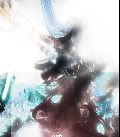
I like the design, but for a banner it could use more detail in my opinion   Last Edit: Mar 6, 2009 14:11:49 GMT by ScottCool
|
|
|
|
|
|
|
You're probably not gonna like my comments but here goes anyway..
The contrast is screwed up, especially on the right.
The whole banner is too sharp, and although the right side is brighter than the rest, the banner has no clear focal, and everything needs a focal of some kind.
And lastly.. depth. There is none at all.
|
|
|
|
|
|
I worded myself wrong I ment like Stinky Said, Depth and a point of focus.
|
|
|
|
|
You're probably not gonna like my comments but here goes anyway.. The contrast is screwed up, especially on the right. The whole banner is too sharp, and although the right side is brighter than the rest, the banner has no clear focal, and everything needs a focal of some kind. And lastly.. depth. There is none at all. all though I beg to differ on some points, I appreciate the comments, and i'll look it over. thanks for being honest and giving actual criticism  Scottcool, thanks for elaborating
|

What, you wanted to check out a shweet tutorial?
|
|
|
|
|
Hmm... I dunno, the abstract is good, but there seems to be no true focus, or it is just to plain. I honestly can't tell you I know what is missing, but I can say I'm not too crazy on this one. Sorry. Also, name of Abstract?
|
|
|
|
|


![Nathan[Gone] Avatar](http://sz-ex.com/_v2/avatar/v2_orange.png)


