|
|
|
Well they are vector shapes so I want them kinda simple. I would like to stick with only white as a color as well but there are some icons who looks ugly in only one color so I had to make some others as well. I am thinking about not including those with more than two colors in the pack though.
|
|
|
|
|
|
|
Sorry and thank you.
And for the light backgrounds thingy. I am going to include a black edition of the icons in the pack as well ^^
|
|
|
|
|
|
I am making a pack with vector icons for RocketDock and other dock's that supports PNG files. Preview:  Here's a list of icons that are already done. - Utorrent
- 3Ds Max
- AE
- AI
- Counter Strike
- DW
- Endorphin
- Firefox
- FL
- *Hidden*
- Ivy Generator
- Maya
- 2 different Mudbox logos
- Notepad++
- PS
- RapidShare
- RapidShare Plus
- Recycle Bin (Empty and Full)
- Spotify (large and small)
- Tunatic
- TuneUp
- Unreal Editor
- Zbrush
- Opera
- Paint.NET
- WMM (White and colored)
- iTunes
- Live Messenger
- Skype
- MediaMonkey
- InstallShield
- My Documents
- Downloads
- Cinema4D
- GIMP
- FlashGet
- AIM
- IE
Suggest more icons for me to put in the pack please.
Last Edit: Nov 20, 2009 22:32:21 GMT by NinthJake
|
|
|
|
|
|
You should always keep away from dual focals.
Have one render and some small, easy-to-read text right next to it.
The effects are pretty good and so is the flow. Good job and keep it up ^^
|
|
|
|
|
And when you say you got permission to post this.... you didn't make it? Yes I did make it. But since I made it for a company I need their permission to officially post it. Thanks for the crits people  Also I actually don't know how that neon green got there  It's supposed to be the same light green as the hills.
|
|
|
|
|
|
Sorry, what do you mean by "completed"?
If you mean the lack of content then it is because it is a "template". Content will be added to the website directly.
If you mean that it is really simple then yes, but it is supposed to be very simple because it is a website that is meant for kids (6 and up) to browse on.
Thank you for your reply.
|
|
|
|
|
Finally got permission to post it  The design is copyrighted to EnviroGame UF and is under no circumstances permitted to be reposted by anyone other than me (NinthJake) 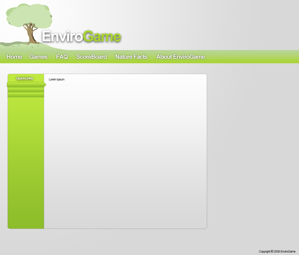 Tell me what you think please 
|
|
|
|
|
You are absolutely right. I forgot to mention that ^^ Thank you for not getting mad like most of the people would
|
|
|
|
|
Your colors are conflicting with each other. Use only two base colors and then work around them (use small changes of those base colors later). I ground this especially by your background. You have used a light base color (white) with a dark color for details (black) and then used a dark purple and a lighting blue for your board. Use either a dark or a light color scheme. Sorry if this sounds harsh 
|
|
|
|
|
Just thought of some improvements. You have dark text on a dark background pretty often. It makes the text really hard to read. Sometimes you even use a cursive font with a dark color, which makes the readability next to nil. Love your art and creativity though
|
|
|
|
|
|
Ok thank you all.
I'll see if I can do any of those.
|
|
|
|
|
It looks pretty good to me Nice job man!
|
|
|
|
|
I do, but I get distracted [؟] by reading subtitles. Lol. But how do you learn without reading the subtitles?
|
|
|